
Eclipse
Research, Design, Prototyping, Testing
Clara Bradford, Elisa Krebs, Aswati Panicker
Introduction
A typical employee spends - on average - six hours a week per week in scheduled meetings. Unfortunately, meeting participants do not always participate optimally, or equally. Frequency of verbal contribution can not only affect who gets heard, but who gets credit - and eventually, who gets rewarded, or punished.
How might we promote a more inclusive meeting room environment that encourages more equitable speaking time, preserves anonymity, enables supervisors, and empowers team members to express themselves?
What is Eclipse?
Eclipse is a mobile application/chat plugin that tracks people’s verbal contributions in terms of time spoken during meetings.
We envision Eclipse being used anywhere people participate in meetings, provided there is a smartphone or other listening device present.
How Eclipse Works
Supervisors assign team members to their team.
Users attach their voice to their handle in the system.
Once in a meeting, the team leader triggers the Eclipse listen function.
Eclipse then listens to the meeting until told to stop, and forgets what is said.
Contribution levels are represented using visual language, ignoring language barriers.
Why Eclipse Is Important
As documented in a study published by the Harvard Business Review, a woman named Cheryl was in a meeting. Over the course of the meeting, Cheryl raised the most ideas, which were then enthusiastically supported by a colleague named Phil. Phil often iterated on Cheryl’s ideas and expanded on them - something that Cheryl reported as making her feel supported.
Yet when later asked who had generated the most ideas, attendees of the meeting incorrectly attributed the ideas to Phil, despite them not originating with him. This, coupled with the fact that men tend to dominate 75% of conversations in a conference setting, indicate a troubling reality: quantity can outweigh quality in terms of how people are perceived in group meetings.
See Two User Flows
Eclipse offers two flows: that of the team lead (or supervisor) and that of the team member. Supervisors can see team contribution levels during a meeting, while team members only see their own contribution.
First User Flow: Supervisor


team view included
Not anonymOUS
no judgment, Allowing Team Leads to contextualize speaking time
Second User Flow: Team Member


individual view only
anonymOUS
visualizes how contributions may be seen/interpreted by others
Design Process

Exploratory
Literature Review
Observation Studies
Case Studies
Exemplar Collections
Artifact Analysis
Generative & Evaluative
Rapid Ideation
Interviews/Concept Testing
Wireframing
Medium - High Fidelity Prototyping
Usability Testing

First Frame: Gender
Well documented/warranted, but risks being inherently combative.
Second Frame: Interruptions
Universally unacceptable, but may ultimately punish well intentioned colleagues.
Final Frame: ContributionS
Trackable, potentially anonymous, non-combative, and malleable.

Primary Constraints and Considerations
How might we create a design that promotes respect while also taking an intentionally non-gendered, non-combative stance?
How might we address the outside perception of our users while remaining non-gendered, non-combative, and preserving user anonymity?
How might we use color and physicality to effectively communicate data and enable user insights without being judgmental?

ABSOLUTELY MAD ALCHEMY
Our generative process cycled between ideation and iteration as we stress tested whimsical ideas through various user scenarios. Threads of these ideas evolved and merged into our final Eclipse prototype. Consider:
The Respect-o-Meter: what if everyone had a rating that indicated how respectful they were reported as being by others?
The Catharsis Box: what if during meetings, whenever you felt frustrated, you could tap your phone and add kindling to a digital fire to burn?
Respect Goggles: what if there were goggles that allowed you to see everyone’s respect rating as indicated on the Respect-o-Meter?

USABILITY
For our testing, we conducted five remote, task driven usability tests along both user flows.
Participants were selected to represent both team leadership & team membership from a wide range of vocations, including lawyers, pharmacists, cybersecurity engineers, enterprise directors, and team leads.
Participants were walked through a scenario and asked to complete a set of tasks (run a meeting, then find and interpret results).
Problem Scoping and Framing
To satisfy our prompt (“Design for Respect”), we identified the meeting room as an ideal design space. We chose the meeting room for its physicality, its myriad of uses, and - what we believed - for its history of disrespect.
We also believed that a design driven solution targeting a meeting room would have wider marketability.
To anchor ourselves with exploratory research, we conducted observations of students as they held group meetings.
These observations were informal, and primarily served to validate some of our broader assumptions: namely, that meetings are stressful, regardless of environment.

Gender
What if our design tackled gender tensions by seeking to promote an environment of respect across the entire gender spectrum?
Why We Almost Chose Gender…
During our early brainstorming and observation sessions, we decided to target the meeting room. Secondary research confirmed our assumption that most companies have a long way to go in the game of respect - especially in the meeting room.
The relationship between men and women in the workplace proved a rich design space precisely because it was so fraught with challenges and hurt. It was here that we encountered uncomfortable numbers, but perhaps most informative was the statistic from the Journal of Language and Social Psychology which indicated that men interrupt women 23% more often than they interrupt other men. Vitally, this data point drew our attention to idea of interruption.
“Men will dominate 75% of the conversation during conference meetings.”

Shown above are screens from the (now inactive) Woman Interrupted App website. This application heavily influenced our design, and is ultimately responsible for our decision to create a non-combative product. Source
Artifact Analysis
As we explored existing solutions and designs aimed at addressing this disparity, we conducted an artifact analysis on an application called the Woman Interrupted App.
What We Liked:
preservation of user anonymity
conversations are not recorded
bold color scheme
What We Didn’t:
combative language of tutorials and mission statement
off-putting assumptions made about both genders
unfinished (conceptual only)
…And Why We Didn’t
Our ultimate assessment of this application came down to a new and deeply formative question: what is the cost of a politicized product?
While no doubt stemming from a place of good intent, the combative stance of the Woman Interrupted App risked alienating half of its potential users based on their gender before it made its way onto their phones.
During usability testing, we confirmed this assumption with various participants.
“A non-gendered application is more widely inclusive . . . A non-gendered application belongs to everyone who needs it.”

Takeaway: Willow Stance
How might we create a design that promotes respect while also taking an intentionally non-gendered, non-combative stance?

Interruptions
What if our design could track interruptions? Interrupting someone is universally disrespectful. Regardless of background or context, interruption is never good.
Don’t Call Me Shirley
Having moved on from the gender problem, we returned to the question of interruption. Revisiting the idea of respect - and how difficult it can be to identify a universally acceptable definition of that word - we synthesized that fluidity with the notion of interruptions. No matter what your background or culture, we reasoned, nobody likes to be interrupted.
What if our design could track interruptions? Interrupting someone is universally disrespectful. Regardless of background or context, interruption was never good.
Surely, this was our unmovable point upon which to build our design.
We were wrong, of course. But we will return to this in a moment.

Above: This was one of our early function flows, which still included features which would not be carried forward, including “Respect Ratings” and an “Interruption Tracker”.

Above: We outlined the pros and cons of including the various features we were considering for our application.
The “Good” Interrupter
At this point we began to build out flowcharts of desired design functions. At first, we felt that targeting interruptions would be a safe metric to visualize.
Further observations of group meetings revealed a game changing insight: interruptions are not intentionally disrespectful.
In three observed meetings, people would get so excited about someone’s idea while they were speaking that they would jump in and “co-op” the conversation.
We were then faced with a problem. How would we realistically teach a program to differentiate between a positive interruption and a negative interruption?

Takeaway: Anonymity
How might we address the outside perception of our users while remaining non-gendered, non-combative, and preserving user anonymity?

Contribution
For our third frame, we considered contribution time as something an application algorithm might easily - and impartially - track.

We looked to various forms of visual inspiration. We loved the use of color and language to convey a mood. Image Source
The First Language
For our third frame, we selected contribution time as something an application algorithm might easily - and impartially - track.
Recalling the vibrancy of Woman Interrupted App, we began to explore a visual language with which we might capture and convey complex and nuanced information.
We looked for inspiration in a wide range of places, while also considering what could be represented visually and understood at a glance.
“If the meeting was recorded, and somebody timed how much talking each person did and added it up, then certainly I’d like to be more aware of the fact that I may be hogging the conversation.”

Visual Language
How might we use color and physicality to effectively communicate data and enable user insights without being judgmental?

2: thinkering
Wireframes - Iteration 1 - Iteration 2
Hello, NSA
At this point, we moved forward with a mobile application/chat plugin that tracked the verbal contributions (in terms of time spoken) during meetings.
Our application would neither record content nor make judgments about whether speaking more or less was a good or bad thing. The design would only gather data about the amount of time people spoke - leaving judgment to the team lead.
Early wireframes prioritized what we would eventually call the Contribution Wedge; a visualization of conversation contributions in a pie graph.
The Contribution Wedge is the beating heart of our design, and as such we knew it had to be front and center of the application, even in name.
Other features (monthly aggregates, team lead contact capability, and curated recommended reading) would either come later or not at all.
Due both to the visual nature of the Wedge (and the implications of being overshadowed) we decided to call our application Eclipse.

Shown Above: We each contributed potential names for our application. These were four of the candidates. From Design Notebook No. 1
“Eclipse: Noun. The total or partial obscuring of one celestial body by another. Verb. To reduce in importance or repute.
”
Team Member Flow: First Iteration


Supervisor Flow: First Iteration


I Sit On The Fence, My Grass Is Always Green
Early feedback to our initial vision for the Eclipse app was positive, though it left a few parties we interviewed confused concerning some points we’d taken for granted.
One individual was skeptical of the idea that team leaders were a necessary component of a business endeavor. In this view, the Eclipse application would be hindered if a meeting was conducted without someone in a designated leadership position.
Another interviewee was turned off by the support systems inherent to the Eclipse app, saying it was not their responsibility as a supervisor to “babysit” their employees.
“Feeling unappreciated was a top reason for employee exits in 2017.”
Nuts and Bolts
Further user interviews pushed us to experiment with a more streamlined home page in the application itself (as shown in the second iteration screens), as well as an overall simplification of user input possibilities.
This stemmed from a question from a panel as to whether we saw Eclipse as a stand-alone application or as a plug-in that might be available to existing chat platforms such as WebX, Slack or Zoom.
Future iterations would also see us reconsider the pie graph to better accommodate our color blind users. Towards this end, we began to think of offering a pattern based delineation.
“I like this idea. But what happens if the team lead is colorblind, like I am?”

3: into the wild
Usability Testing | Findings | Ideal vs. Real Users

Shown Above: Our user testers came from a wide array of professional backgrounds. Logo Sources: (Versprite, IBM, L&LR, Wexner Medical, SRC)
Testing
What We Tested
To improve the usability of Eclipse, we conducted remote, task driven usability tests along two user flows: the supervisor and the team member.
Who We Tested
We drew our testers from a wide pool of career fields, including medicine, law, defense, cyber security, and information technology. We recruited testers who fit two primary characteristics:
that they felt they worked in a somewhat “corporate” environment
that they conducted or participated in a large number of meetings every week.
Our testers also covered a wide spectrum in terms of responsibility, ranging from a Program Director at IBM to an informatics pharmacist at at the Ohio State University Wexner Medical Center.
Five Usability Tests
Tester 1: Program Director
Works at: IBM | Meetings Per Week: 25 | Status: Supervisor
Notable Quotes: “I manage managers.” “How is this data being used?” “What if Eclipse tracked how many times you interrupted or spoke over people, but it only showed you and not your team lead?” “I think the non-gendered approach was the right one.” “This would go a long way to fight for inclusivity.”
Tester 2: Attorney
Works at: L&R, P.C. | Meetings Per Week: 3-5 | Status: Team Member
Notable Quotes: “How are you making sure this doesn’t turn into a tattle-tale app?” “I like the idea of tracking interruptions, but how would that work?” “What happens if I’ve had more than one meeting today? Would it show me my most recent contribution or in aggregate?”
Tester 3: Project Manager
Works at: SRC | Meetings Per Week: 8-10 | Status: Supervisor
Notable Quotes: “I assume the one who spoke the most is me, since I’m leading the meeting.” “I’ve got a guy who spends a lot more time listening and absorbing, and less time actually speaking, but he makes a valuable contribution when he speaks.” “I can see the benefits, but I’m big on quality over quantity. You don’t want people to talk just to talk.”
Tester 4: Informatics Pharmacist
Works at: Wexner Medical Center | Meetings Per Week: 8-15 | Status: Team Member
Notable Quotes: Re: the Microphone Screen - “I feel like this screen is a little ambiguous. I think it could use some more words.” “I feel like this experience is designed for both [myself and my employer].”
Tester 5A: Security Consultant
Works at: Verspire | Meetings Per Week: 9 | Status: Supervisor
Notable Quotes: “You’ve just got to make sure that this app doesn’t make people feel bad for speaking less.” “I’m a big quality over quantity guy. [Some people] just talk and talk and say nothing.”
Tester 5B: Security Consultant
Works at: Verspire | Meetings Per Week: 9 | Status: Team Member
Notable Quotes: (Roleplaying as Jack) “I assume I spoke a lot in this meeting, because the big gray wedge is the same color as my name.” “Eclipse is not against me, but it’s definitely not helping me.” “I think even though it’s not actively punishing me, I should have a way to make myself look better. Right now, if my wedge is small, that makes me uneasy.”
Findings
Calibration 1
Overall, users showed little confusion in terms of interactions.
One of the main points, as best articulated by Tester 5, was the issue of color misleading the user as to which part of the Contribution Wedge was “theirs”. This can be resolved by ensuring that colors align across wedges, letters chips, and text.
Calibration 2
The second point, as best articulated by Tester 4, was ambiguity on the “Microphone Start” screen. Like Calibration 1, this is an easy fix, calling for the addition of guidance text beneath the icon. Carrying this insight forward into future iterations, we need to be vigilant in making sure our users know when their input is required.


User Comments & Future Features
USER COMMENT: “I THINK EVEN THOUGH IT’S NOT ACTIVELY PUNISHING ME, I SHOULD HAVE A WAY TO MAKE MYSELF LOOK BETTER. RIGHT NOW, IF MY WEDGE IS SMALL, THAT MAKES ME UNEASY.” (TESTER 5)
FUTURE FEATURE: GOAL SETTING
user comment: “I love the idea of the physical artifact. i love the idea of being able to look at something on the wall and see how inclusive my division is - or is not.” (tester 1)
future feature: renewed exploration of the “wallflower”
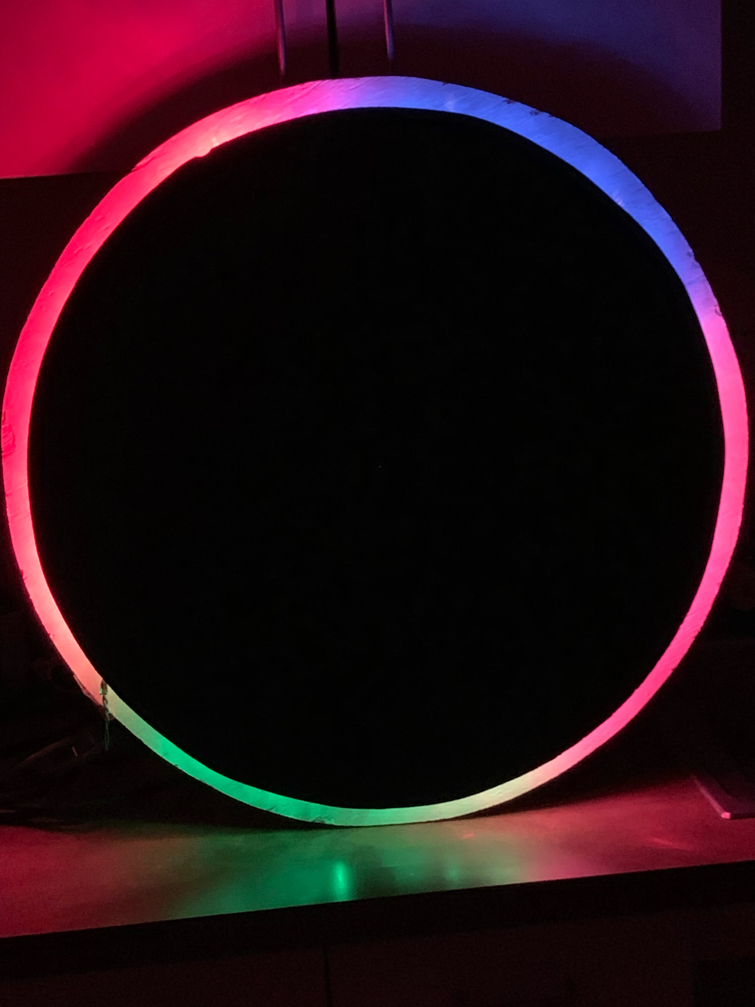
The Wallflower
Dubbed “The Wallflower” by Dr. Eli Blevis, our final concept was a circular disk which could be mounted on a wall that would light up to show different contributions as indicated by an array of colors. This shifting kaleidoscope of colors would reflect contribution levels of users in real time.
Colors and hues would be vague and anonymous so as to protect users’ identities, but by seeing a visual representation of their contribution somewhere public, we hope users will feel a sense of pride if their hue swells or shrinks, depending on their Goals.
Given more time - especially given the strong interest we received from IBM - we would like to create a higher fidelity physical prototype using sheet metal and LED lighting.


user comment: “I want to know if i’m talking over people. What if Eclipse tracked how many times you interrupted, but it only showed you and not your team lead? ” (tester 1)
future feature: private interruption tracking
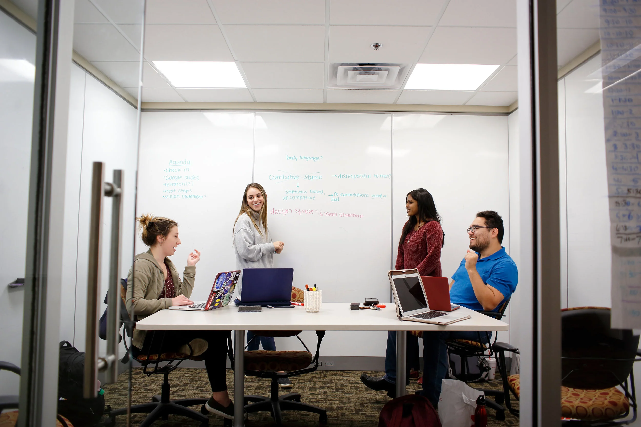
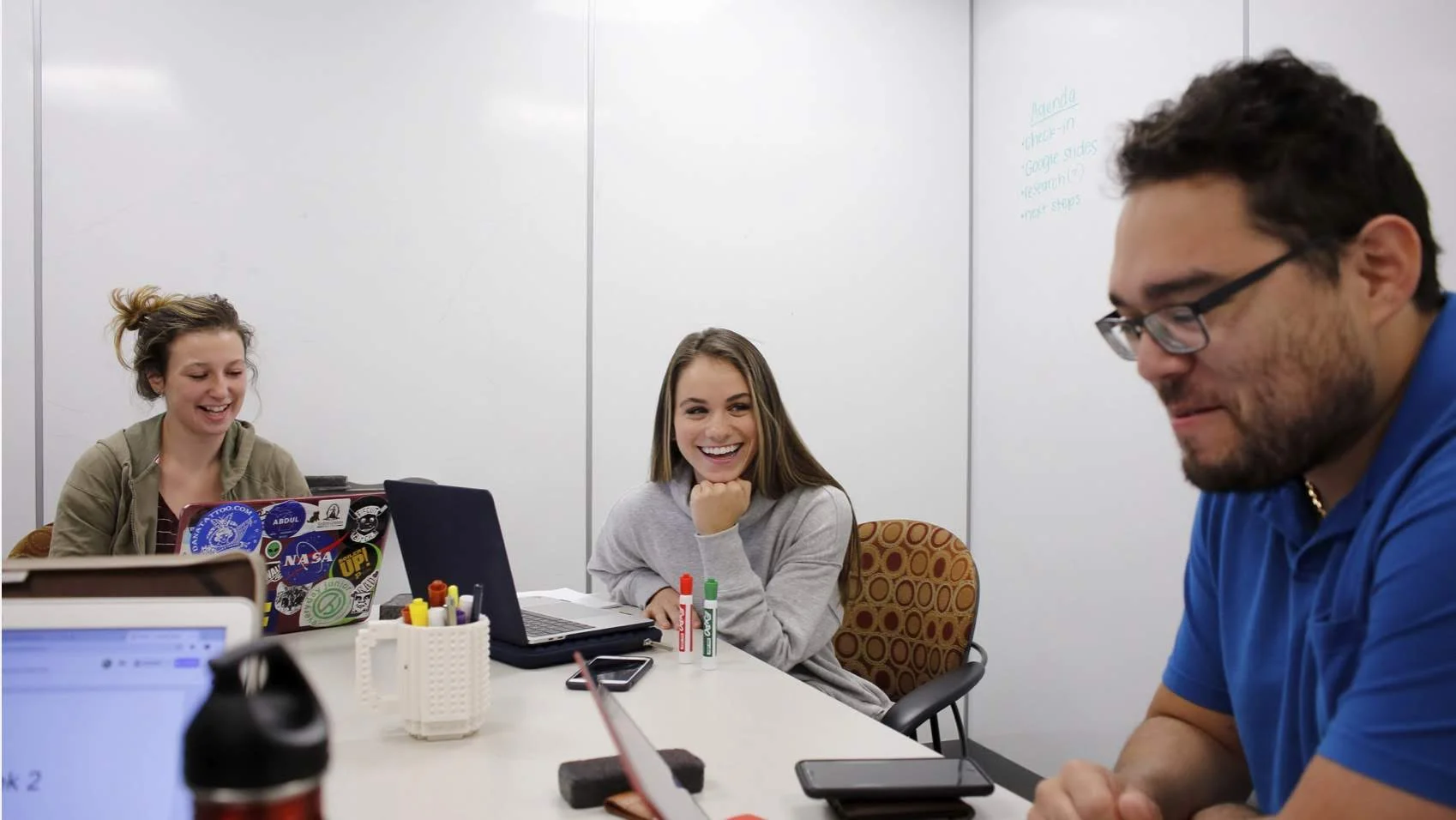
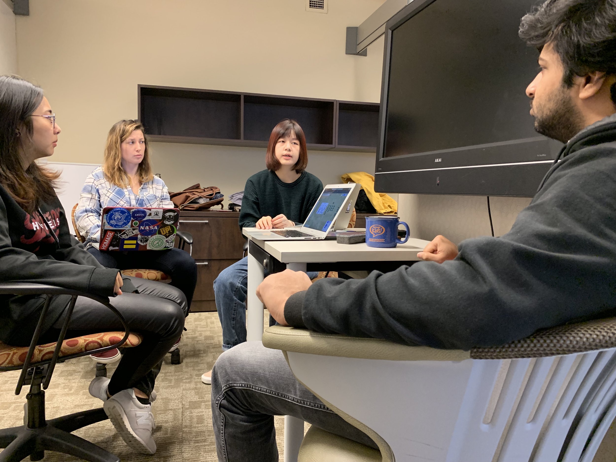
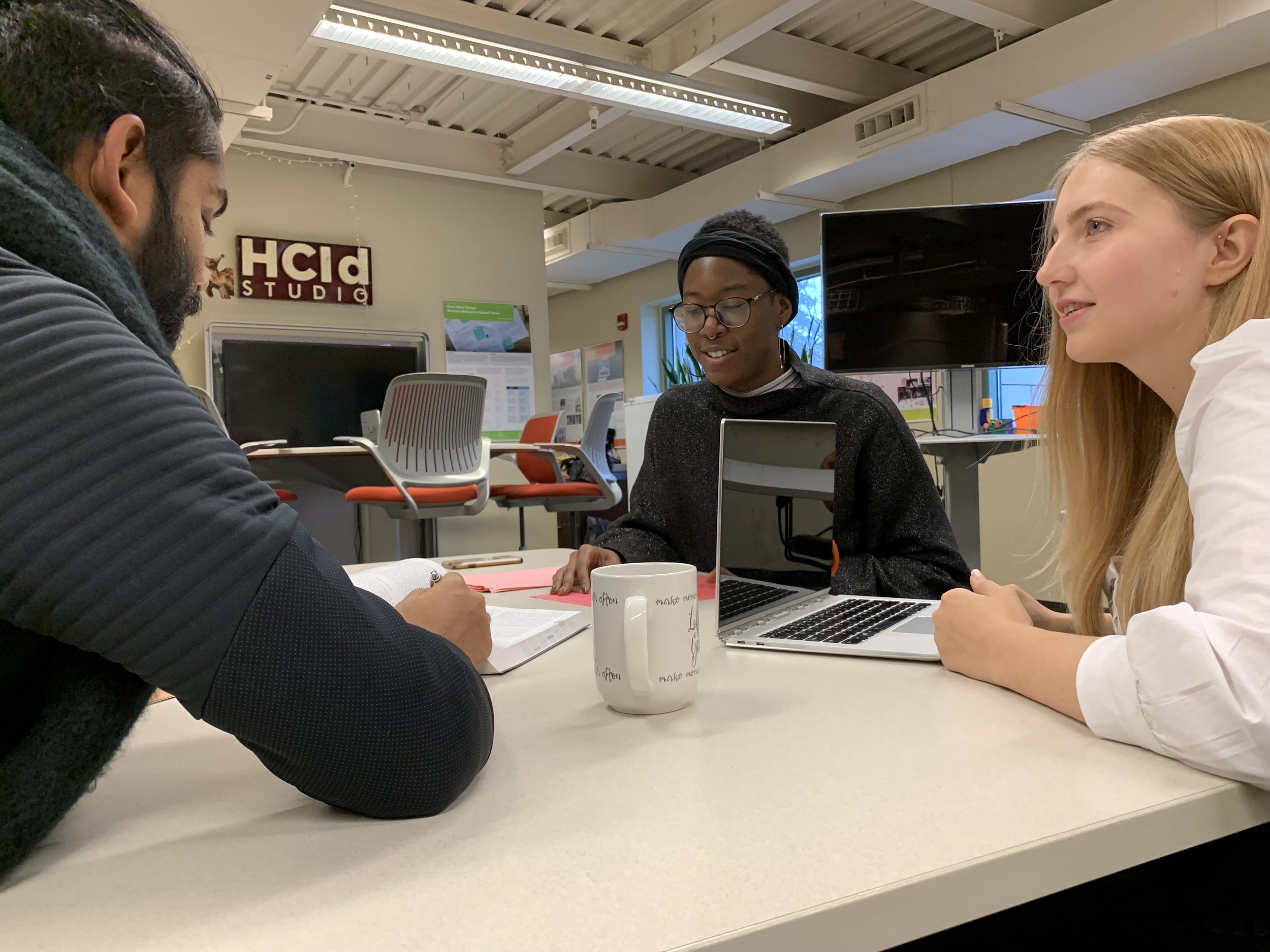
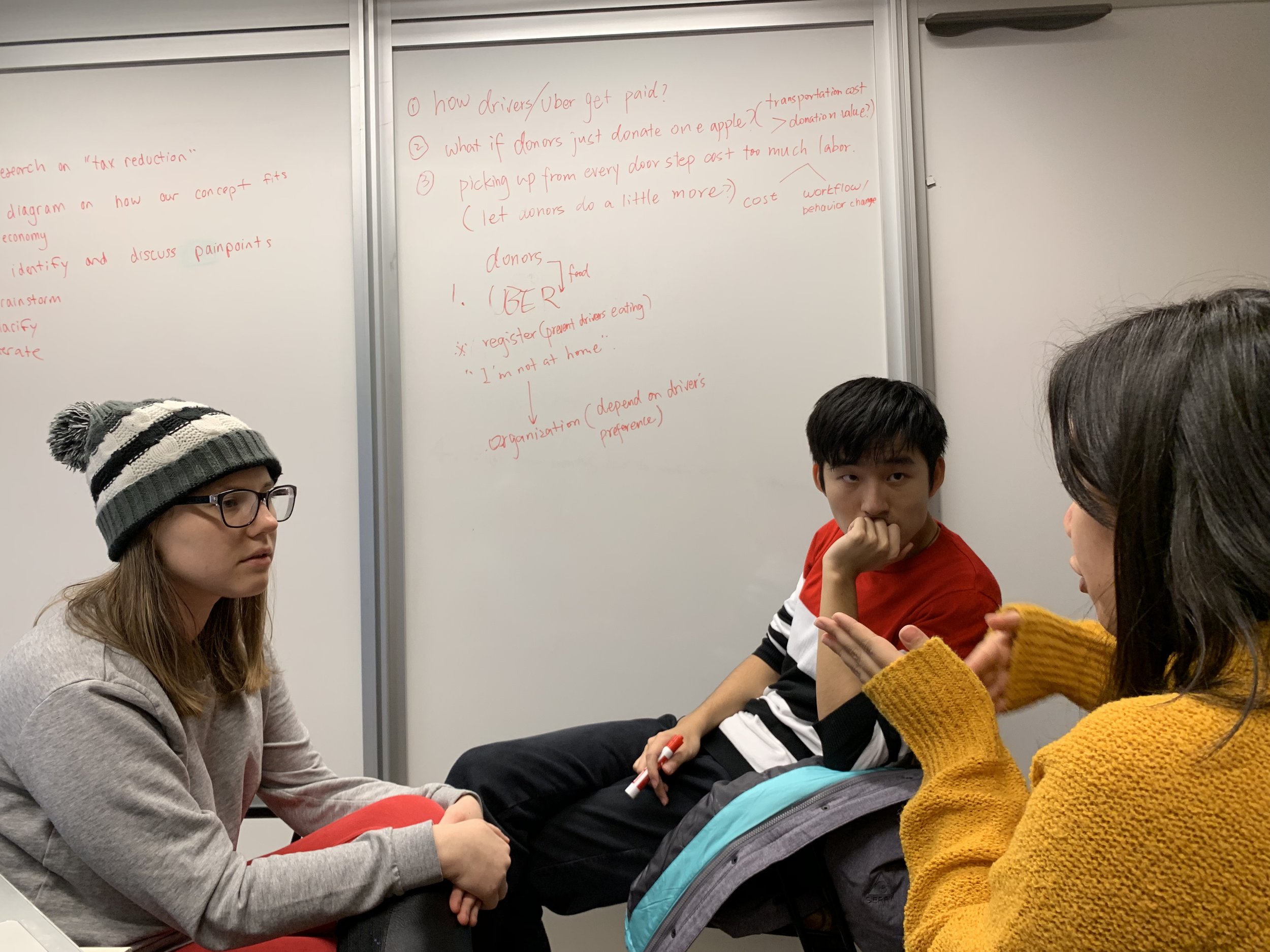
Shown Above: The team at work on the Eclipse in the design studio. Shown Below: (Left) The team at rest.
